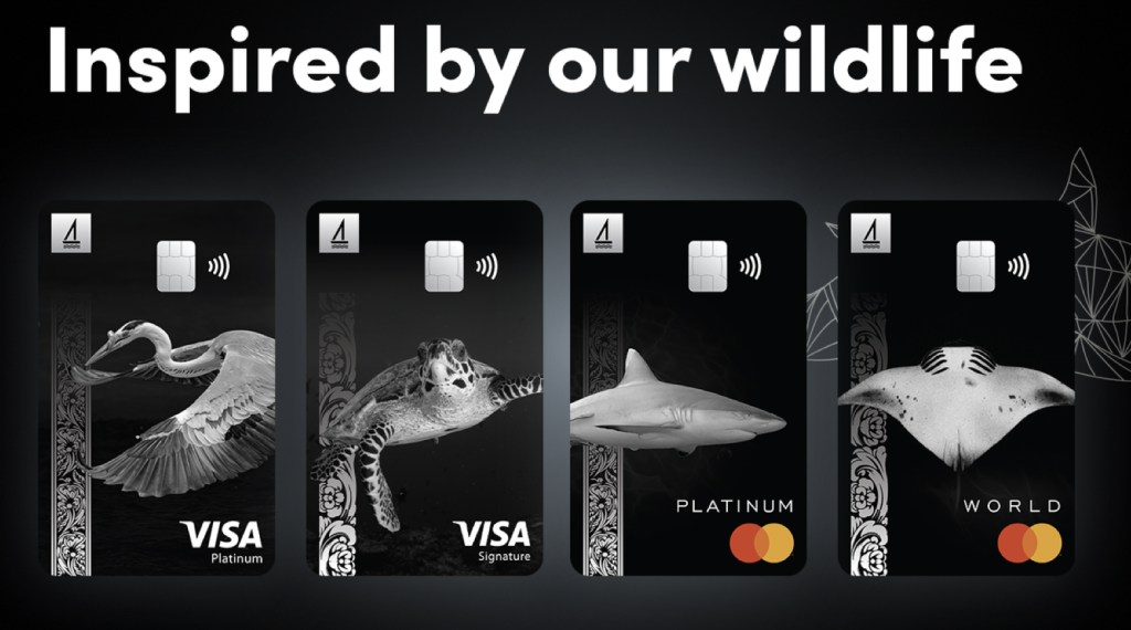
When it comes to Brand Communications, the ‘new designs’ by the Bank of Maldives (BML) say a lot about what its brand has come to represent — which might not necessarily be all that the brand itself might want to present itself as.
Even at an initial glance you can’t help but think that “It’s been done before.” Even the local competition, the Maldives Islamic Bank, which has been in the market for less longer, has done a version of this that is more striking, memorable, vibrant, and colourful than the BML execution. So, design-wise and brand-wise, this feels ‘safe’ and as safe as ‘safest’ can be.
It’s also a reflection of the market; and the type of images and collateral used in the market, at least a few generation’s removed. Anyone who has had a passing glance at designs for bank cards has seen a variation on this starting at least two decades ago. If you squint ever so lightly and look at these cards you’d be hard pressed to make a distinction from those 20-year-old designs, or even at least one ‘black’ design that the bank itself has deployed for years now. The card even looks like it would feel as ‘generic’ in your hand as any old bank card. So relying on ‘what works’, at the expense perhaps, of not realising that that was what worked before while other brands have since moved on to more invigorating approaches which resonate across different segments of the market instead of just this consistently staid approach.
The layouts are generic to the point of, in this day and age, feeling template, and awkward. There is not even a modicum of excitement or thrill that one might normally associate with the ‘wild’ creatures featured in the designs. The ‘minimal’ approach has stripped them of their character, and verve, and the framing, including using the now so generic looking lacquer design pattern, feels rote and wholly unoriginal. The sum of the card is lesser than its individual communications components; the choices here are not elevating the photography nor the other design elements to more than what they are. On the contrary this approach is stripping them of their most arresting qualities.
There is zero innovation here in terms of design, presentation or, among others, product features, even material design/approach. The notion, while a real possibility, that people will be rushing to embrace the ‘new’ design in droves by cancelling their current cards feels silly. At least the current ‘generic’ card design doesn’t pretend to be something it is not.
The design does however say that this is a ‘legacy’ brand that plays ‘safe’ and is concerned about being perceived as ‘serious’, especially among their peers in the financial community — even at the expense of alienating their core customer segments who might possibly prefer to be recognised for their passions and interests, with a little bit of colour or emotion thrown in and who have nothing to do with the financial world.
It would have been interesting to see designs that embraced and celebrated the every-day ‘customer’ vs.’serious bank with intellectual ambitions’. Failing that, there could have been an inspired compromise. Alas, this approach by ‘aharenge bank’ [our/my bank] speaks more to being focused on the ‘bank’ bit than ‘aharen’ but ‘aharen’ feels more central a theme to capture, from a branding point at least.
Editor’s Note: The writer, although not a designer, has worked in communications for over 25 years and has both local and limited international experience across several nationally significant projects.

